In identifying a colour that would connect with the overall trend of looking both ways, we noted that all the key trends for 2016 had an element of gold in them. Out of the broad palette of yellows we identified, we have carefully selected the one yellow that best represents the golden influence of the coming year’s colour trends. We have selected a gold influenced monarch which is both bright enough to attract attention and combines well with other tones.
Gold and gold tones are being used everywhere in the design world. It is a recurring colour and material at design fairs and in graphic design as well as in architecture, fashion, beauty and interior decorating. We feel that this is a beautiful next step, a natural evolution and transition from the coppery orange that was the colour of the year for 2015. We’ve designed a colour palette to work beautifully with the Colour of the Year 2016 to create a tonal effect, a relaxed neutral combination or something more surprising.
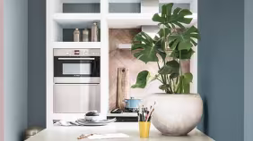
Here are some ideas on how to decorate your home with Gold.